Louisa Chan

  • About
  • Appreciations
  • Blog
  • Services
    • Digital Marketing Consultancy
    • Strategic Training Alignment Consultancy
    • Done With You Marketing
    • Latest Corporate Training / Master Classes / Seminars
  • Contact
You are here: Home / Archives for mobile template

How To Make A Mobile Friendly Blogspot Blog Site II

January 10, 2012 by Louisa Chan Leave a Comment

How To Make Your Blogger Blog Site Mobile Friendly?

Do you know if your online visitors are reading your blog posts? One sure way to drive away online visitors is not to show up the way they expect you to when they want you to.
3 seconds is too long
Today many online users are surfing the net with mobile devices and they want your site to load “now”.
We have inherited the ADHD culture and people expect everything to be instant.
If you are a doctor who blogs whether it is about  your specialty area or of a hobby,  you want to make sure that your content is showing up well on mobile devices.
Why?  Simply because more people are consuming your content through mobile devices, smart phones, tablets and eReaders.
Gen Y or Baby Boomers?
Let’s step back for a moment. Who is your target audience? Who are you writing for?
Fellow doctors? New Gen Y Residents and Interns?  Seasoned MDs, Fellows, Academicians and Professors (aka baby boomers with thick glasses maybe)?
How many of these are rushing around in their daily job? And when do you think they get a chance to check email or catch up on some articles?
I am picturing residents, interns and those on call and in the ERs. They get to check mails and catch up on surfing  when they are waiting in line for their sandwich or when they are catching a few moments of rest at the couch – using their mobile phones.
Your blog posts need to show up fast and fit the little mobile screen with big enough fonts. Your readers eyes are too tired from lack of sleep and hours of documentation to want to squint to make sense of those dancing words.
Here’s the statistics.
90 % of so-called Generation Y users said they use their mobile phones more than desktop or laptop computers to access the Internet and 19% of tablet owners are over 55 by Q2 2011.
So you need to make your blog site mobile friendly
Wordpress.com (not the self hosted ones on WordPress.org) as well as Tumblr and Posterous have default mobile friendly themes when accessed via mobile phones.
In this post, I outline steps you can use to “mobify” your Blogger blogspot sites. Nothing technical, it’s basically going to the right place to activate the mobile friendly theme.
So when you are ready, follow these simple steps.
strong>Step 1:Log into your Blogspot Dashboard and choose “Settings”.
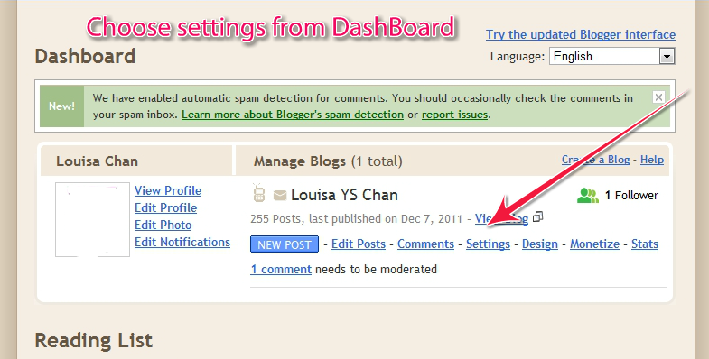
Blogger Dashboard
Step 2:From Settings, choose “Email & Mobile”
Choose Mobile Settings
Step 3: Here, choose “Yes” to show mobile template. You can choose from a few themes and preview them before you save your settings. And that’s it!
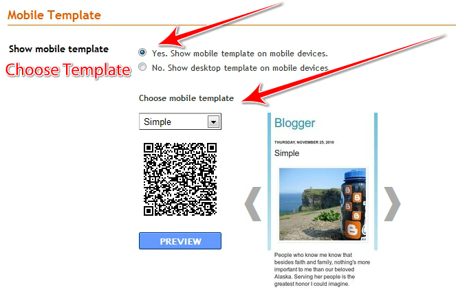
Choose Mobile Tempplate
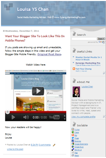
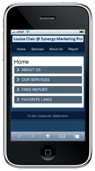
If you now view your Blogger blogspot.com site on your mobile phone, it would look like the diagram on the left below instead of appearing like a tiny squished up version of what you see on your lap top or PC.
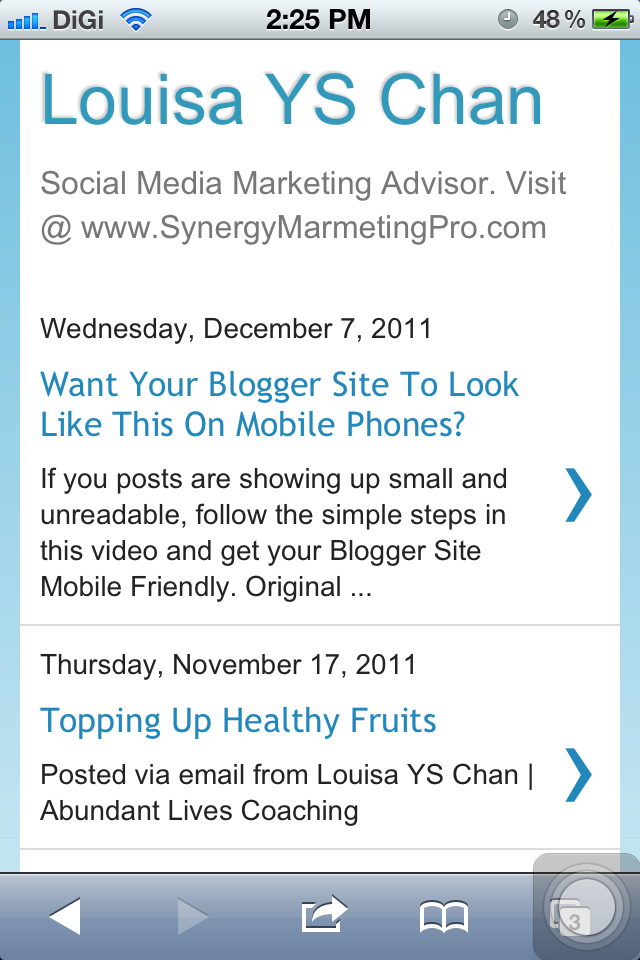
Louisa Chan's Blogspot Mobile SiteLouisa Chan's Blogger Website
See the difference?
Cup of Coffee And The Doctor Who Cares?
Now, there are limitations with using Blogger’s Blogspot; the biggest being that you do not own the content on Blogger site (ie your blogspot.com) and you are not building your own online professional branding.
I would recommend that you explore hosting your own domain for your blog content (like having  www.DrWhoCares.com) so your readers will associate your content and expertise with you on your domain instead of seeing www.DrWhoCares.Blogspot.com.
This will cost you a tiny hole in your pocket but not much more than a cup of coffee a day.
But if you are a casual blogger who writes for hobby then your next best bet is to make your blog site mobile friendly and continue to put great stuff on your blog site!
Post first published on Malaysia Medical Resources.
Related post on mobile friendly sites:
How To Make A Mobile Friendly Blogspot Blog Site
How Does Your Website Show Up On iPhones and iPads (Mobile Phones and Tablets)?

Filed Under: Blog, Local and Mobile Marketing, News and Media Tagged With: Blogger Blog Site, How to, mobile blog, mobile blogger, mobile blogspot, Mobile Friendly, Mobile Friendly Blogger, Mobile Friendly Blogspot Site, Mobile Friendly Site, mobile marketing tips, mobile marketing tutorial, mobile template, mobile view, mobile websites

How To Make A Mobile Friendly Blogspot Blog Site

December 7, 2011 by Louisa Chan 7 Comments

How To Make Your Blogger Blog Site Mobile Friendly?


A Native Mobile SiteMany friends I know like blogging. And some start with using Blogger from Google. Interestingly enough WordPress is a much more Search Engine friendly platform for blogging and it is also much more flexible.

Since many of my friends are using Blogger, I like to suggest a quick and easy way to make your blog site more friendly to your readers. Like that?
If you are not thinking of switching over to using WordPress.org then you want to make your blogger site mobile friendly. When I view these Blogger sites on my iPhone (or any other mobile phone), I see that most sites are in still showing in Web View.
They do now show up well on my mobile device; generally referred to as not being mobile friendly.
What this means is that it will take much longer to load your site (therefore your readers may not want to spend on my data plan and leave your blog site!) or that they will not be able to read much since your fonts will be to small.
To make your Blogger blog site mobile friendly, just follow the simple steps outlined in this 5-minute video.

How To Mobify Your Blogger BlogSport Site


Just like that, you now have a mobile friendly site. Congratulations! This will not affect your normal website, that will still show up in Web View for those visiting you on their PC or lap top. In case you prefer a walk through with diagrams, check out “How To Make A Mobile Friendly Blogspot Blog Site II“.
If you are blogging with a view to promoting your ideas, cause, services or products, you will be better off using another platform (such as WordPress.org) so you can build your own online asset and have your own domain name.
If that is something you like to do, leave me a comment or contact us and we will show you how you can easily set up your own search engine and mobile friendly WordPress Blog without being a technie.
It’s no difficult (it’s quite fun actually) and you’ll reap some Search Engine benefits too. If you have any questions just post them at the comments below or post them at the Louisa Chan’s Facebook Page and I will be responding with either a video or a blog post.
If you find this helpful, feel free to pass this on. Many more people will be accessing your site using mobile devices, don’t lose out! For more regular tips, sign up for our newsletter here.

Filed Under: Blog, Local and Mobile Marketing, Social Media Marketing Tagged With: Blogger Blog Site, How to, mobile blog, mobile blogger, mobile blogspot, Mobile Friendly, Mobile Friendly Blogger, Mobile Friendly Blogspot Site, Mobile Friendly Site, mobile marketing tips, mobile marketing tutorial, mobile template, mobile view, mobile websites

How Does Your Website Show Up On iPhones and iPads (Mobile Phones and Tablets)?

October 10, 2011 by Louisa Chan 1 Comment

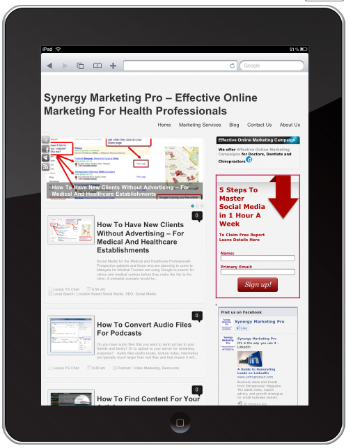
Synergy Marketing Pro On iPad

Mobile Site For Readers In The Mobile World
So you’ve paid to have a a great website designed with flash videos and everything nice. Then while waiting at the cash counter, you pulled out your newly bought iPhone4S and decided to look up your own website.
Lo and behold, you see maybe half the screen after 3 minutes of loading and buffering.
Websites Are Not Mobile Ready
Now that is not uncommon.
Websites are not designed to show up on mobile devices in optimum time.
That is why it can get expensive to browse websites on mobile devices.
And your flash videos are not going to play on iOS so your iPhones and iPads will not be able to see those video content.
So what do you do?
You need a mobile site, not a smaller version of your web site but a site designed for the mobile users in mind. More people expect you to have a mobile site for fast navigation and ease of use. Mobile sites are not static brochure pages but a way for you to interact and engage with your prospects and clients.
Non Mobile Ready Online Presence This is not what you want.
You want a complete new design of a site that has the mobile users’s experience in mind.
Let’s take a look at this next image; that is a mobile site designed with the mobile user in mind.
It loads quickly, has everything you need at one glance, and with easy navigation.
Of course you can make it look fanciful and colorful with logos and graphics.
I prefer to keep it simple because having images will take extra time to load not to mention it taking up my precious online real estate.
But you certainly can have logos and images to improve the aesthetic look. You just have to bear those factors in mind in your design so it does not fill up the page nor take too long to load.
So Is Your Web Site Mobile Ready?

  • Will the millions and billions of mobile users want to wait for your page to load or will they go somewhere else?
  • Are you reaching out to mobile users – who are increasing by the seconds or are you being left behind?

It is no longer a luxury to have a mobile site but a necessity – if you want to tap into mobile users. Mobile sites have been shown to increase page view, conversion rate and therefore sales. Even if your business does not have a website, you need a mobile site, because by 2014, mobile users will be the norm.

Mobile Site meant for Mobile Devices

A native mobile site: m.SynergyMarketingPro.com hope you find this post useful. This post will explain why you need a .mobi and a .com when you can do a redirect form your website. If you have any questions just post them at the comments below and I will be responding with either a video or a blog post.
Remember to leave me a comment or feedback and if you find this helpful, feel free to click “share”!

Filed Under: Blog, Local and Mobile Marketing, Social Media Marketing Tagged With: How to, iPad, iPhone, mobile blog, Mobile Friendly Site, Mobile Phone, Mobile Sites, mobile template, mobile view, mobile websites

Creation and Marketing

Accredited by HRD Corp MY

Certified Professional Trainer (IPMA UK)

Teach Online

Click Here To Buy

Podcasts on Reflections

Reflections-Newletter

Get weekly tips on building an online teaching business.
 

News iTunes Stitcher

Search

Categories

  • Blog
  • Business Growth
    • Resources & Tools
    • Tutorial
    • Weekend Reflection
  • Coaching, Training and Teaching
  • Content Marketing
  • Heart-Centered Marketing
  • Local and Mobile Marketing
  • Personal Development
  • Social Media Marketing
    • eMail Marketing
    • Facebook Marketing
    • Google, Google Plus
    • LinkedIn Marketing
    • News and Media
    • Pinterest Marketing
    • Podcast
    • Video Marketing
  • Facebook
  • Instagram
  • LinkedIn
  • RSS
  • YouTube

Connect With Me

  • Facebook
  • Instagram
  • LinkedIn
  • RSS
  • YouTube

About Louisa Chan

Louisa is an Author, Content Strategist, Coach and Trainer. She helps you build rewarding businesses so you have the time to serve bigger purposes.

Find Out How

Get in Touch!

Get in touch anytime if you would like to find out more about having public or in-house corporate training or for for coaching for online teaching or content creation.

  • Heart-Centered Marketing
  • Content Marketing
  • Coaching & Training

© 2025 www.louisachan.com • Privacy | Terms of Service