Mobile Site For Readers In The Mobile World
So you’ve paid to have a a great website designed with flash videos and everything nice. Then while waiting at the cash counter, you pulled out your newly bought iPhone4S and decided to look up your own website.
Lo and behold, you see maybe half the screen after 3 minutes of loading and buffering.
Websites Are Not Mobile Ready
Now that is not uncommon.
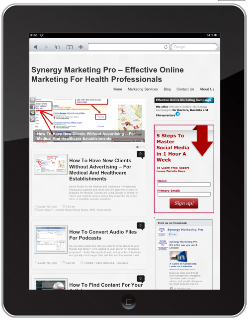
Websites are not designed to show up on mobile devices in optimum time.
That is why it can get expensive to browse websites on mobile devices.
And your flash videos are not going to play on iOS so your iPhones and iPads will not be able to see those video content.
So what do you do?
You need a mobile site, not a smaller version of your web site but a site designed for the mobile users in mind. More people expect you to have a mobile site for fast navigation and ease of use. Mobile sites are not static brochure pages but a way for you to interact and engage with your prospects and clients.
 This is not what you want.
You want a complete new design of a site that has the mobile users’s experience in mind.
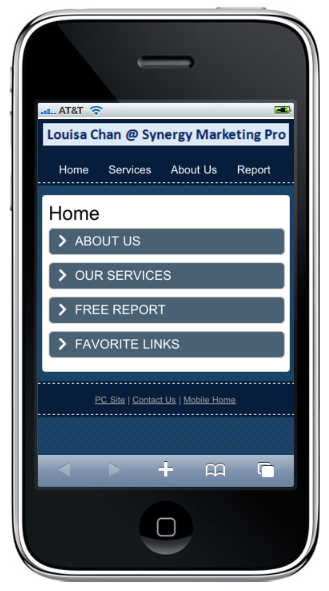
Let’s take a look at this next image; that is a mobile site designed with the mobile user in mind.
It loads quickly, has everything you need at one glance, and with easy navigation.
Of course you can make it look fanciful and colorful with logos and graphics.
I prefer to keep it simple because having images will take extra time to load not to mention it taking up my precious online real estate.
But you certainly can have logos and images to improve the aesthetic look. You just have to bear those factors in mind in your design so it does not fill up the page nor take too long to load.
So Is Your Web Site Mobile Ready?
- Will the millions and billions of mobile users want to wait for your page to load or will they go somewhere else?
- Are you reaching out to mobile users – who are increasing by the seconds or are you being left behind?
It is no longer a luxury to have a mobile site but a necessity – if you want to tap into mobile users. Mobile sites have been shown to increase page view, conversion rate and therefore sales. Even if your business does not have a website, you need a mobile site, because by 2014, mobile users will be the norm.
A native mobile site: m.SynergyMarketingPro.com hope you find this post useful. This post will explain why you need a .mobi and a .com when you can do a redirect form your website. If you have any questions just post them at the comments below and I will be responding with either a video or a blog post.
Remember to leave me a comment or feedback and if you find this helpful, feel free to click “share”!


[…] Would you prefer this to the one before [design captured here] […]