What’s a landing page?
Presumably a page that you somehow land on while navigating the web. Yes?
Well, yes and no. It is one of those geeky terms that’s confusing.
But a landing page is not the same as a home page. Confusing, I know so let me quickly demystify this for you.
Here’s a few points to note:
- First and foremost, these two pages serve very different objectives
- Not all websites have landing pages
- And when they do, these pages may not be readily visible to the public. That is to say you may not see any menu or navigational link on the site that would link out to these landing pages
Ok, so what are landing pages? And why do websites have them?
Weekend Reflection: Landing Pages
- A landing page can be an opt-in page where visitors voluntarily submit their preferred emails (opt in) in exchange for some valuable content
- Or it can be a sales page for web visitors to click the “Subscribe Now” button
- It can also be a registration page for a webinar, a free consult or something similar
- A landing page’s sole purpose is to lead web visitors to take an ultra specific action, whether that is to click the enroll now button or to opt in to an email list.It has a very clear direction (like a brightly colored call-to-action button) with an enticing offer.
- Highly converting landing pages do not have links on the page. So no top menu, no footer contact information, not side widgets, no breadcrumbs, no links but just some powerful write up on the benefits that the visitors can get by submitting their emails
The landing page’s sole objective is to influence visitors to take an action in exchange for a highly valuable piece of content, whether free or paid.
Home Pages
A home page, on the other had can be a rather busy page (although this is changing and some home pages are opt in pages).
- The usual home page you see will have a top menu that says “Home”, along side other menus like the “About”, “Service”, or “Contact Us” menu
- It is likely to have lots of write up, portfolio images, posts, navigational links, side bars, and contact information in the footer and maybe even slider with images at the top of the page
- One can easily get lost in a busy homepage because there’s so much information and so many options
A landing page, on the other hand, is a highly focused page that keeps web visitors un-distracted.
There’s nothing one can do except to provide the email address or to click the “Register Now” button.
Here are some examples:
1. A simple opt in form on a landing page to submit your email in exchange for a freebie (e.g. a free eGuide, a free consult, to attend a complimentary webinar, to receive regular newsletter etc).

And that’s the entire page, with no side bars, not top menus, no navigational links, so the visitors can’t check out links and click away form the page.
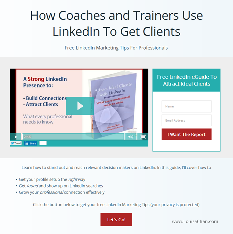
2. Here’s another landing page with a video opt in form. A simple video introduces the offer and the benefits it brings with the opt in form.

Again, that’s the entire page. Clean and streamlined.
Except in this case, there are some bullet points that explain the benefits you’ll get by opting-in and the video makes the offer more personable and gives a little more explanation. Other than that, there are no side bars, no links and no distractions.
3. And you probably have seen those long form sales pages that has no links except strong copies and maybe some video testimonials to influence the buying decision. The only desired action here is for the web visitor to click the “Buy Now” button or the “Sign Up Here” link.
Home pages can have opt in forms too, and many do, but because there is so much information with different action paths, it can get confusing and distracting.
Increasingly, there are home pages that consist of just a simple opt in form. This is when the site owner is only interested in having web visitors who are interested in being followed up with more valuable content. The owner is only concerned to build a targeted list with those who are really interested in having that relationship developed.
But home pages are normally different from what is referred to as landing pages.
Now that you know the difference between the two, make sure you use the right page to achieve your objectives!
For example, if you want to introduce your company to your web visitors, send them to the Home Page or your About Page. And if you want to build an email list or sell your product (or services), then send them to specific landing pages.
Now that the mystery is solved, you may be wondering what makes landing pages effective? That can be another post on its own!

Leave a Reply